

Deeper portfolio insights with portfolio vitals, a revamped analysis page, and more
Here at TrackMyStack, our mission has always been to provide you with the clearest and most comprehensive tools to track your entire financial world. We believe that with the right data at your fingertips, you can make smarter decisions and take confident steps towards your goals.
Today, we’re thrilled to announce a major update that brings a new level of analytical depth to your portfolio tracking. We’ve been listening to your feedback and have been hard at work developing features that move beyond simple performance tracking to offer sophisticated, actionable insights.
Let’s dive into what’s new.
Introducing portfolio vitals: understand the "how" behind your returns
Have you ever looked at your portfolio’s growth and wondered why it performed the way it did? Was it thanks to savvy risk-taking, or was the whole market just on an upswing? Our new Portfolio Vitals (currently in Beta) are designed to answer precisely these questions.
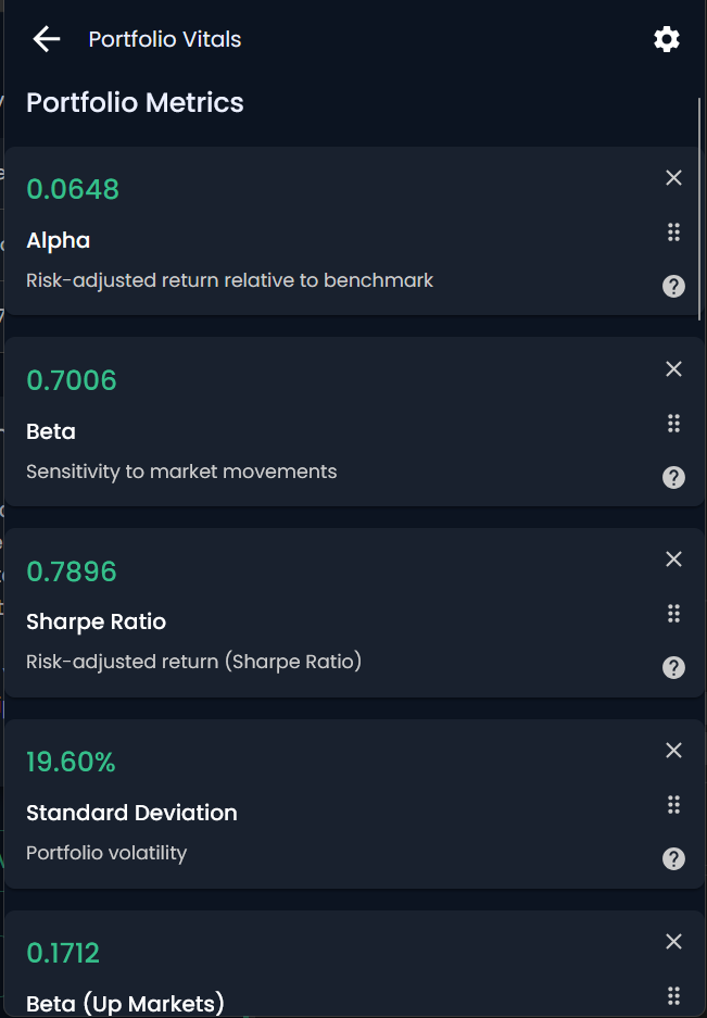
Accessible from our brand-new Analysis page, Portfolio Vitals provide you with core metrics used by professional investors to dissect and understand investment performance.
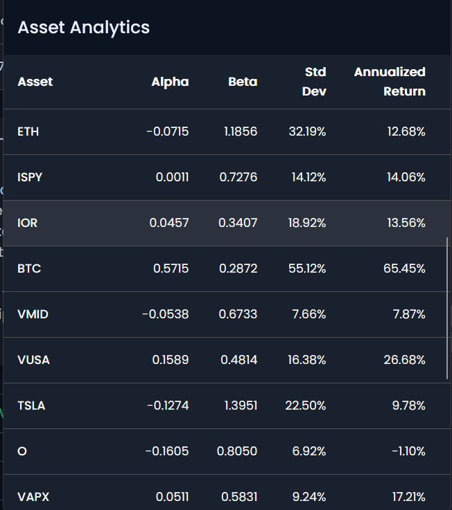
Here’s a breakdown of what you can now track:
Alpha: This is the holy grail for many investors. Alpha measures the excess return of your portfolio relative to a benchmark. A positive Alpha (like the 0.0648 shown in the example) suggests that your investment choices have outperformed the market on a risk-adjusted basis. It’s a measure of the value you, as an investor, are adding.
Beta: How sensitive is your portfolio to market movements? That’s what Beta tells you. A Beta of 1 means your portfolio moves in line with the market. A Beta greater than 1, like the 1.1856 for ETH in the asset analytics, indicates higher volatility than the market, while a Beta of less than 1, like the 0.7006 for the overall portfolio, suggests it’s less volatile.
Sharpe Ratio: This is a crucial measure of risk-adjusted return. The Sharpe Ratio tells you how much return you’re getting for the amount of risk you’re taking on. A higher Sharpe Ratio (0.7896 in our example) is better, as it indicates a more efficient portfolio that generates more return for each unit of risk.
Standard Deviation: This metric represents the volatility of your portfolio. A higher number, like the 19.60% shown, means your portfolio’s value has experienced wider swings. It’s a key indicator of how bumpy the ride has been on your investment journey.
We’ve also gone a step further with Asset Analytics, allowing you to see these vital metrics not just for your portfolio as a whole, but for individual assets as well. This can help you identify which of your holdings are contributing the most to your returns and which are introducing the most volatility.
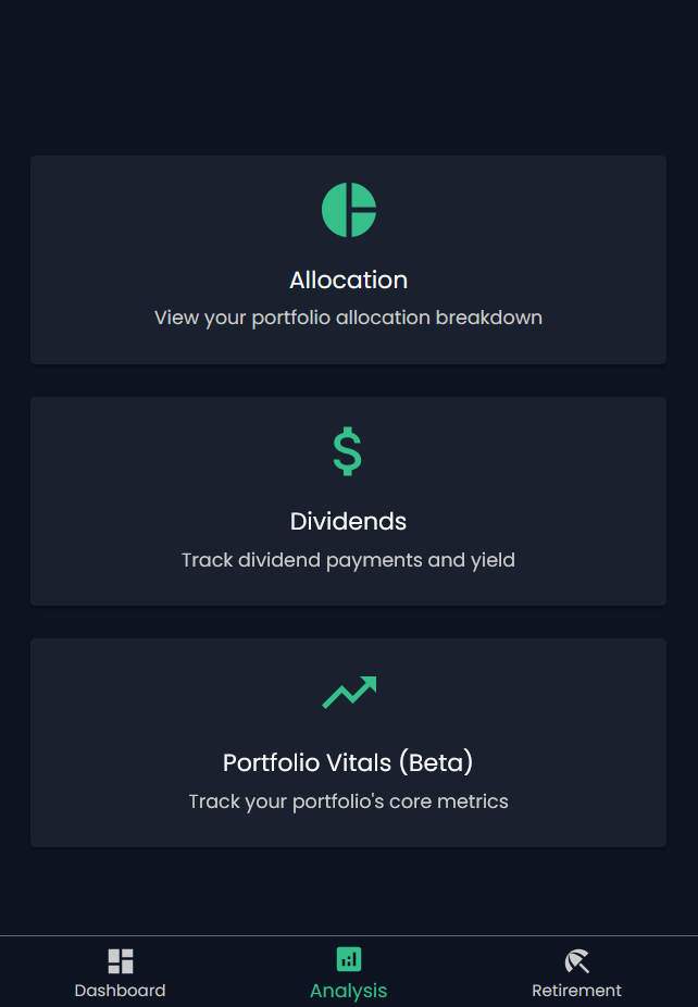
A fresh look: the redesigned analysis page
To house these powerful new tools, we’ve completely redesigned the Analysis page. The new layout is cleaner, more intuitive, and serves as your central hub for diving deep into your portfolio’s performance. You can now easily navigate between your Allocation breakdown, Dividends tracking, and the new Portfolio Vitals. This streamlined design makes it easier than ever to get the insights you need without getting lost in the numbers.
At a glance: see your portfolio's change over time
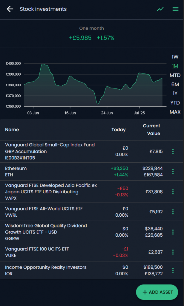
We’ve brought one of our most requested visual features to the forefront. On your individual portfolio pages, you’ll now see a prominent graph charting your portfolio’s performance over various timeframes. With a single tap, you can switch between one week (1W), one month (1M), six months (6M), year-to-date (YTD), one year (1Y), and the maximum available history (MAX). This immediate visual feedback, like the +£5,985 (+1.57%) one-month gain shown on the “Stock investments” portfolio, helps you instantly contextualize recent performance and spot trends.
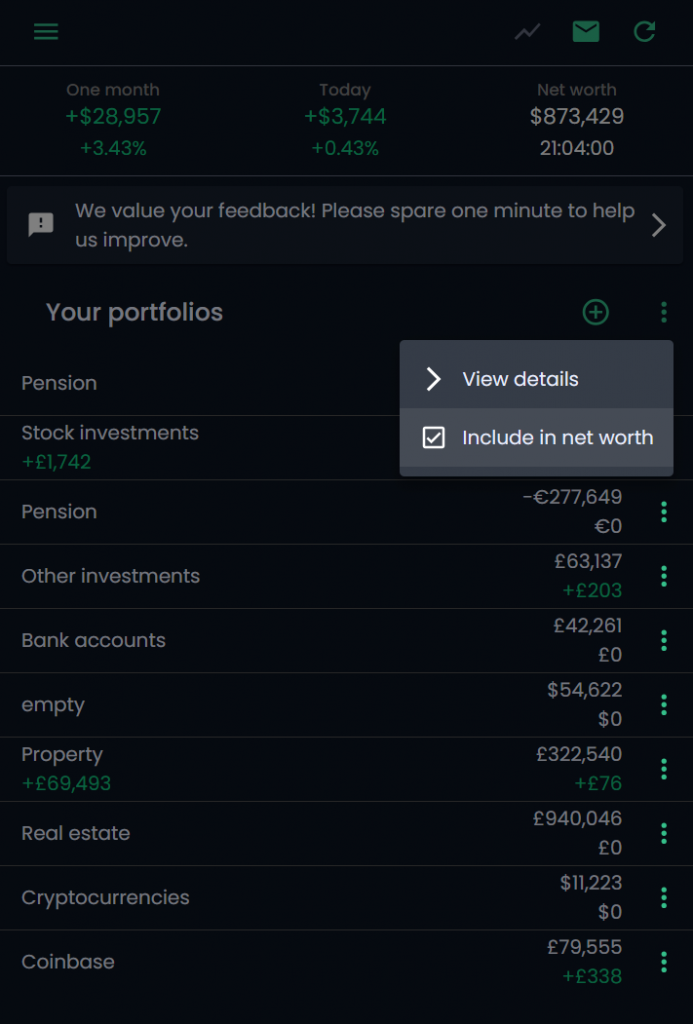
A small change for a big improvement: the "Include in net worth" toggle
We’re always looking for ways to improve your daily experience with TrackMyStack. For users who like to create speculative or “watch-only” portfolios, constantly navigating into the settings to exclude them from your total net worth could be a hassle.
We’ve now made this a breeze. Directly from your main dashboard, you can now tap the three-dot menu next to any portfolio and find a simple checkbox to ✅ Include in net worth. Want to see how your net worth looks without your volatile crypto portfolio? Just uncheck the box. It’s a small but significant quality-of-life improvement that gives you more flexible control over your primary financial view.
We are incredibly excited to get these new features into your hands. This update is a direct result of your invaluable feedback and our commitment to building the most powerful and user-friendly portfolio tracker available.
Log in to your TrackMyStack account today to explore these new features, and as always, please keep the feedback coming. Happy tracking!